Marketing OS
Welcome Platform
Building a product-led growth motion isn’t just about removing friction.
It’s about changing who the product is designed for.
When we reimagined Welcome’s onboarding and core workflows, the platform was still invitation-only and heavily dependent on manual setup. Scaling meant more than automation — it required a shift in mindset.
Instead of designing for the organization, we started designing for the individual user.
That decision influenced everything:
- A self-serve signup experience instead of human-led provisioning
- Interactive onboarding that teaches by doing
- A personalized home experience that answers “what should I work on next?”
- A unified planning system that connects list, calendar, timeline, and kanban views through a single query model
None of these were isolated UI improvements. They were system-level changes that aligned usability, scalability, and performance.
Result: ⇒ 50% / 1,152 WAU YTD growth

Content Marketing Platform
Bringing teams together with a unified marketing operating system.
optimizely.com
Free Signup
Problem
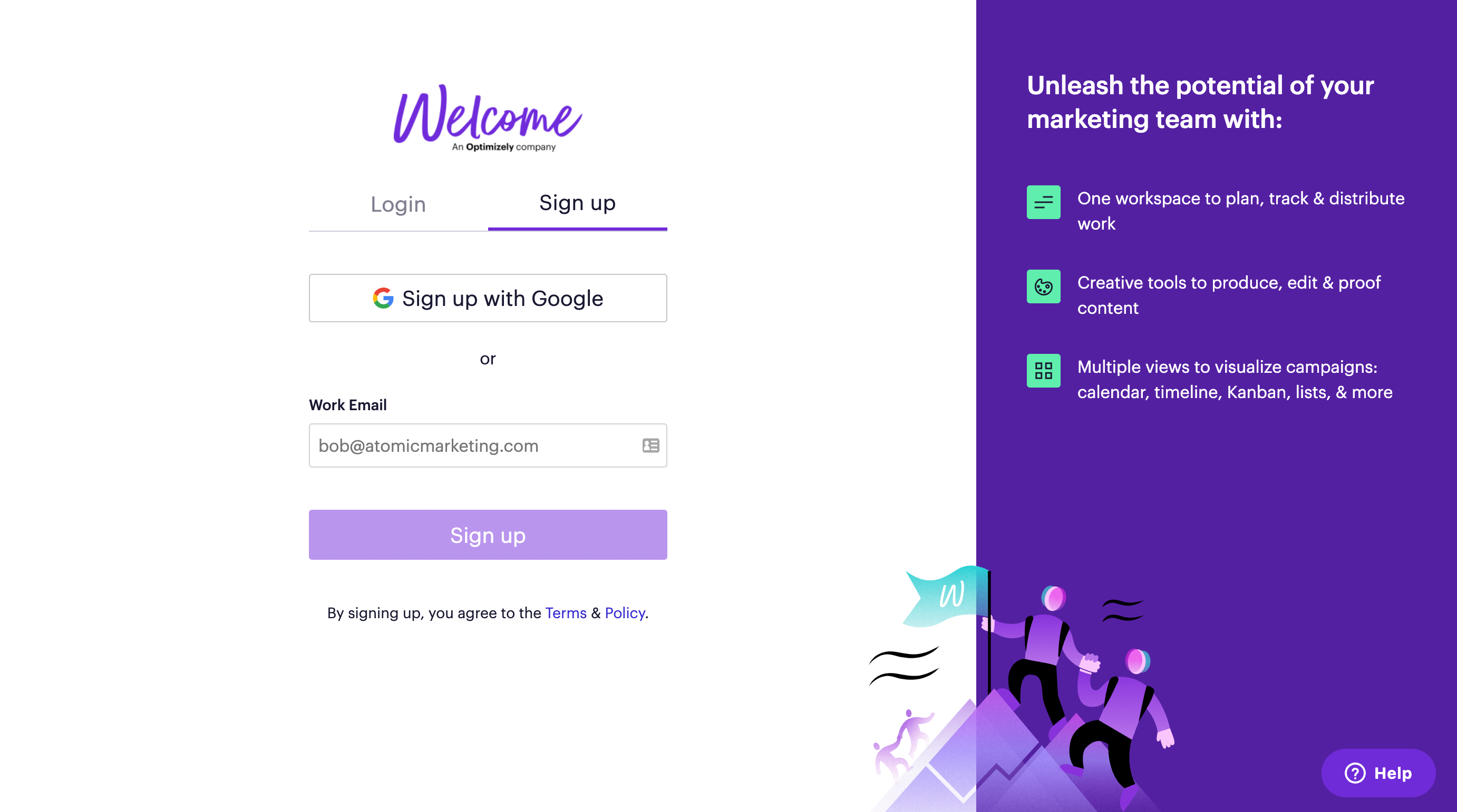
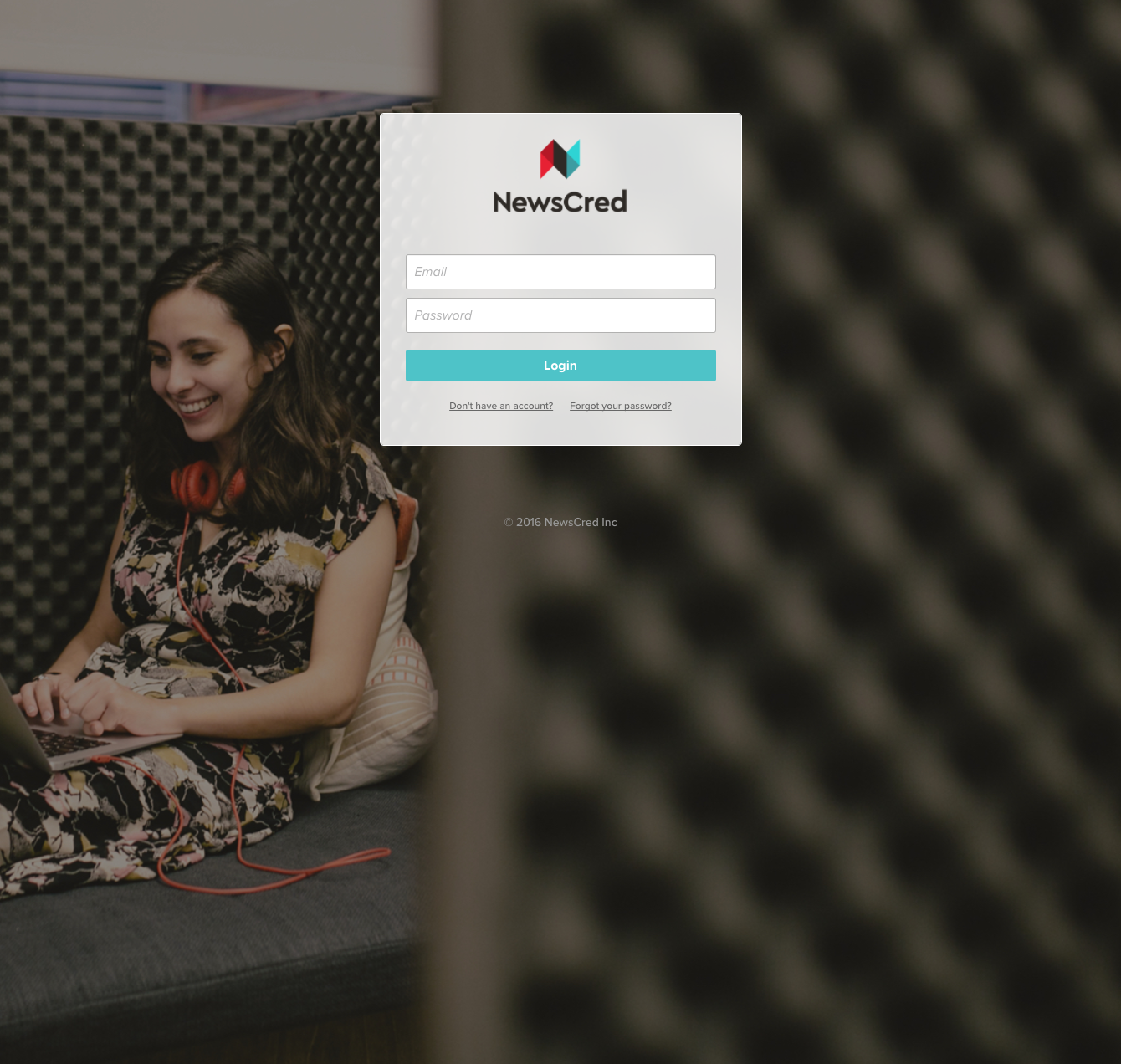
There was no self-serve signup experience. All customer instances (workspaces) were manually created and configured by the technical services team, making the process time-consuming, costly, and difficult to scale.
Solution
We automated instance creation on the backend, enabling users to sign up on their own, explore the product freely, and get started immediately. An interactive onboarding experience guides users step by step, helping them understand value quickly without requiring human intervention.
After
Before
DRAG
Sign up — Before vs. After (No sign up available in the old version)
Homepage
The homepage went through multiple iterations — from an organization-wide, task-centric dashboard, to a performance-driven reporting view, and eventually to a simpler experience centered on the individual user.
Problem
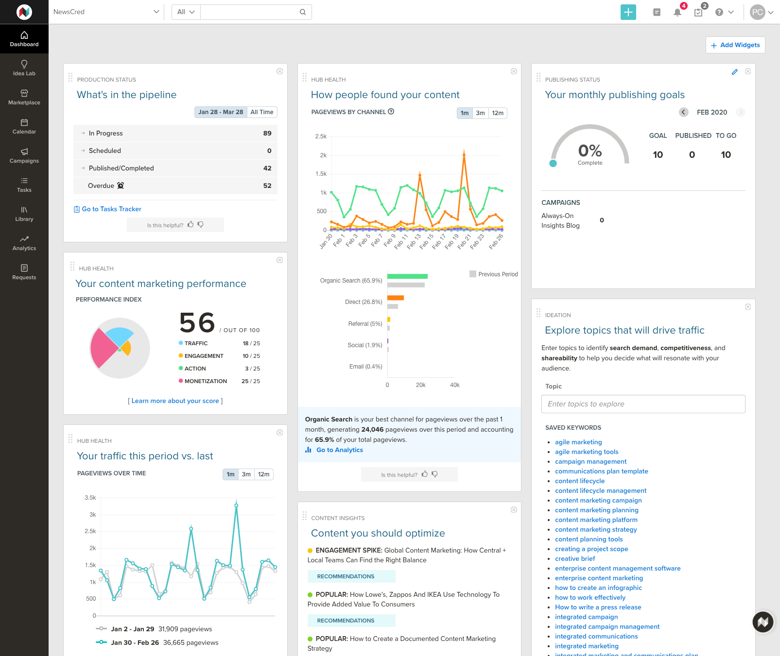
The existing widget-based homepage was designed to give leadership and teams a high-level view of content performance, task efficiency, and progress toward organizational goals. However, for most users, it failed to support their day-to-day work. Users struggled to quickly identify their own tasks, priorities, and next actions, resulting in friction at the very start of their workflow.
Solution
We redesigned the homepage around the individual rather than the organization. The new experience prioritizes personal tasks, clear next steps, and progress visibility, allowing users to immediately understand what they should work on and where they stand. By shifting focus to the user’s needs, the homepage became a more effective launch point for daily work and improved overall efficiency.
After
Before
DRAG
Home — Before vs. After
Plan
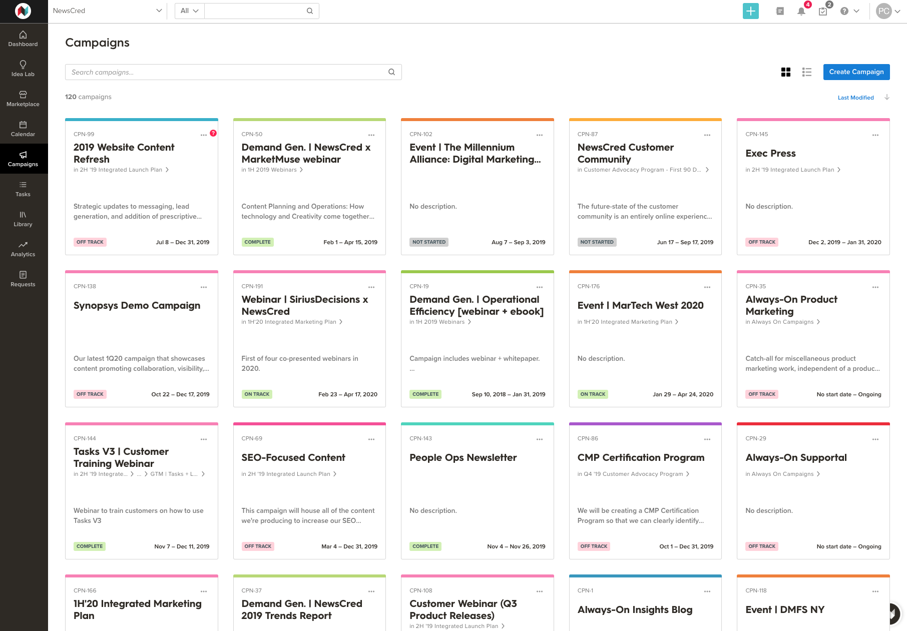
In 2018, we reintroduced campaigns as a core concept with the ambition of evolving the platform into a true marketing operating system. To drive early adoption, campaigns were initially presented as a visually rich gallery experience.
Problem
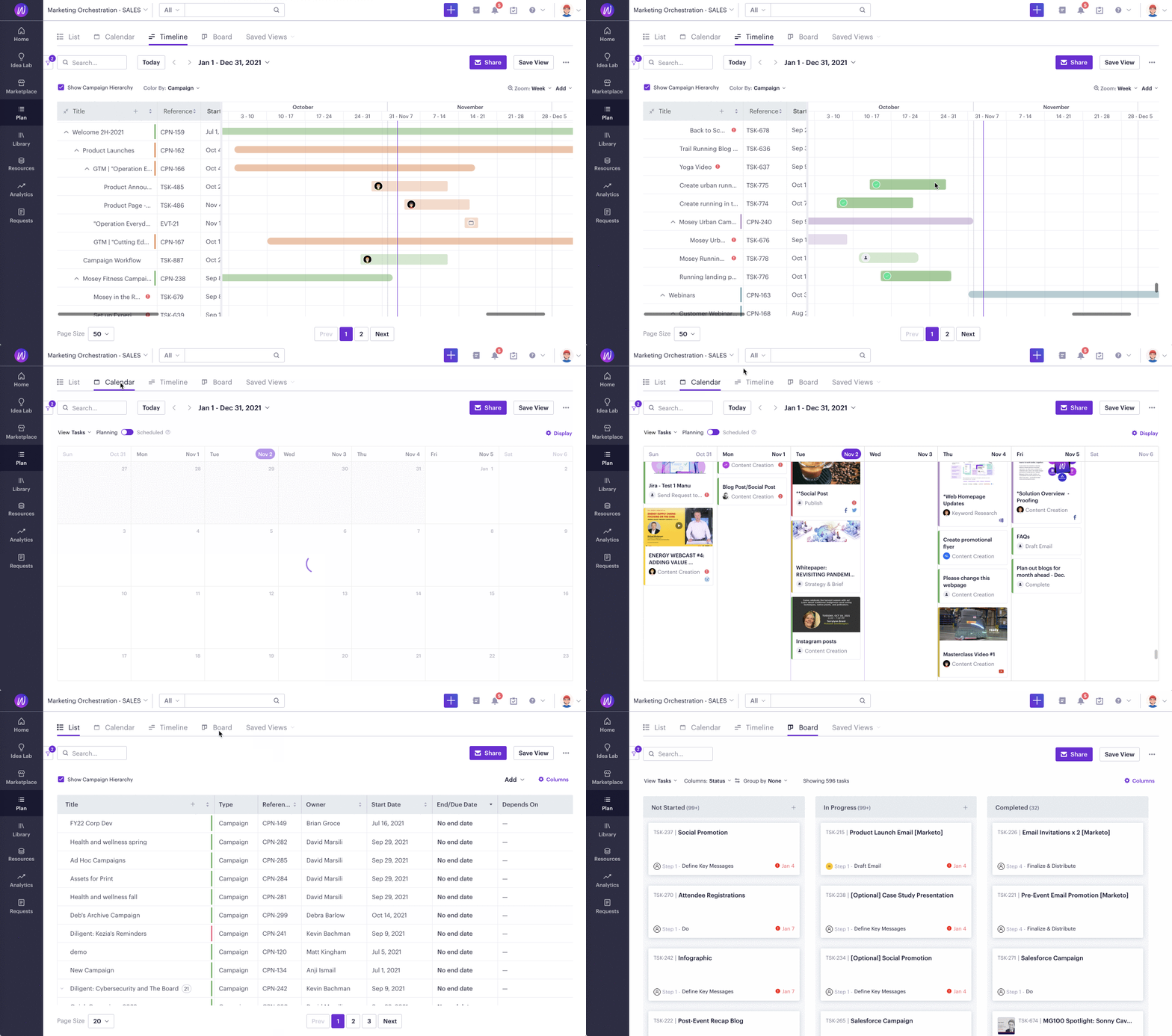
While visually appealing, the gallery-based campaign experience did not scale. Key planning views—such as list, calendar, timeline, and kanban—were fragmented across different modules, creating a disjointed workflow. These views also relied on separate queries, leading to inconsistent results, data discrepancies, and growing performance issues as usage increased.
Solution
We consolidated all campaign planning views into a single module called Plan. Plan provides a unified query and filter model, allowing users to seamlessly switch between list, calendar, timeline, and kanban views without losing context. Users can save and share custom views with their teams, supporting collaboration while maintaining consistency and performance.
This system-level consolidation significantly improved usability, reduced data inconsistencies, and established a scalable foundation for planning across the platform.
After
Before
DRAG
Plan — Before vs. After

Welcome Calendar
Calendars help you keep track of everything your team is producing. In order to be useful, a marketing calendar needs to contain key pieces of information.
optimizely.com
Task
The task page is the core of the platform, accounting for over 70% of total usage. As the product expanded from content publishing into broader project management, tasks evolved to support content creation, coordination, and collaboration across teams.
Problem
The original layout prioritized workflow mechanics over the work itself. Key interactions competed for space, increasing cognitive load and making it harder for users to focus on content and execution as task complexity grew.
Solution
We redesigned the task page to center on the work. Workflow steps were moved from the left to the right to reclaim primary real estate for content. The page was reorganized into focused tabs, allowing users to concentrate on one task at a time.
We later overhauled the workflow system to make it more flexible and expressive, introducing drag-and-drop interactions, rich-text descriptions, and free-form checklists. Together, these changes transformed the task page into a more scalable, creation-first workspace and significantly improved usability for complex workflows.

After

Before
DRAG
Task — Before vs. After
The Marketing OS
Welcome has been recognized as a Leader in Gartner’s Magic Quadrant for Content Marketing Platforms for 8 consecutive years. Maintaining that position—especially in SaaS—requires more than feature velocity. It demands a clear point of view on where the category is going.
As Welcome became part of the Optimizely family, the challenge expanded. The platform needed to support a growing spectrum of users—from enterprise teams with complex governance needs to individual contributors focused on getting work done—each with different roles, goals, and workflows.
Our vision was to evolve Welcome into a true marketing operating system:
a platform that scales to enterprise complexity without sacrificing individual clarity.
That meant designing systems, not just interfaces. Experiences that adapt to different levels of sophistication. Workflows that connect planning, execution, and collaboration into a cohesive whole. And foundations that allow the product to keep evolving as teams, use cases, and expectations change.
The work is never finished.
Listen closely. Design deliberately. Iterate relentlessly.

Optimizely named a Leader the 8th time
The 2025 Gartner® Magic Quadrant™ for Content Marketing Platforms is here, and Optimizely has been recognized as a Leader in CMPs for the 8th consecutive year!
optimizely.com